

What is the Pareto chart and why is it used in business?

A Pareto chart is a graphical representation of a cumulative distribution, often used in business to identify the most important factors contributing to a particular problem or issue.
It is based on the Pareto Principle, which states that roughly 80% of a given effect is caused by 20% of its causes.

In business, Pareto charts are used to identify the key drivers of costs, defects, or other performance measures, and to prioritize improvement efforts based on the greatest potential impact.
By focusing on the 20% of factors that are causing the majority of the problems, managers can prioritize their improvement efforts and get the most impact from their limited resources.
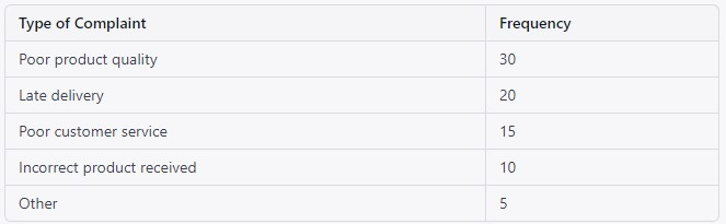
For example, consider a company that is looking to reduce the number of customer complaints about its products. The company collects data on the type of complaints and the frequency of each type of complaint. The data might look something like this:
To create a Pareto chart, the company would arrange the data in descending order of frequency and add up the cumulative frequency of each type of complaint. The chart would look something like this:
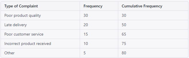
The Pareto chart shows that the majority of customer complaints (80%) are caused by the first three types of complaints (Poor product quality, Late delivery, and Poor customer service).
By focusing on these three types of complaints, the company can target its improvement efforts where they will have the greatest impact.